Dell Support Library
Helping visitors navigate to useful articles.
Overview
As the Senior UX Designer on my team, I was tasked with simplifying our Support Library for visitors coming from two paths. One path was from the libraries homepage. The second, and most common, path was from a search engine. The content needed to be easily digested, and the navigation needed to be pertinent to the visitor in each area.
Analysis
I gathered data and user feedback from our support agent logs and customer surveys to help paint the experience users were having in the Support Library. After noticing high bounce rates for visitors that were landing on "irrelevant" pages from search engine results, I saw the need to show both a contextual navigation and similar articles that could resolve their issue while keeping them in the Support Library.
Solution
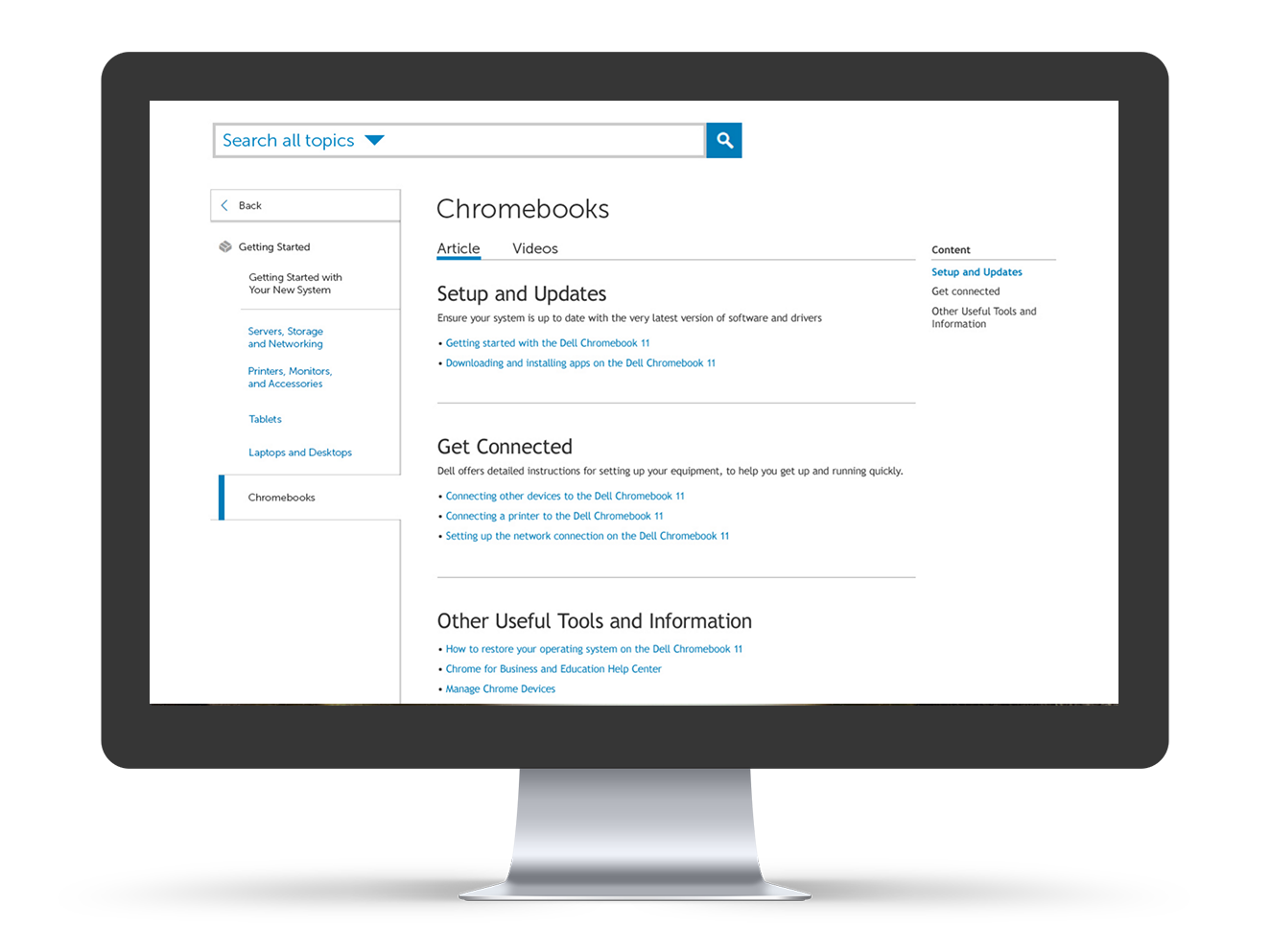
A contextual side navigation was designed which worked like a table of contents. This allowed visitors to scan similar articles even if they landed on an irrelevant page. I followed with redesigning the content layout by implementing clearer hierarchy with an improved font ramp, visual anchors and dividers.
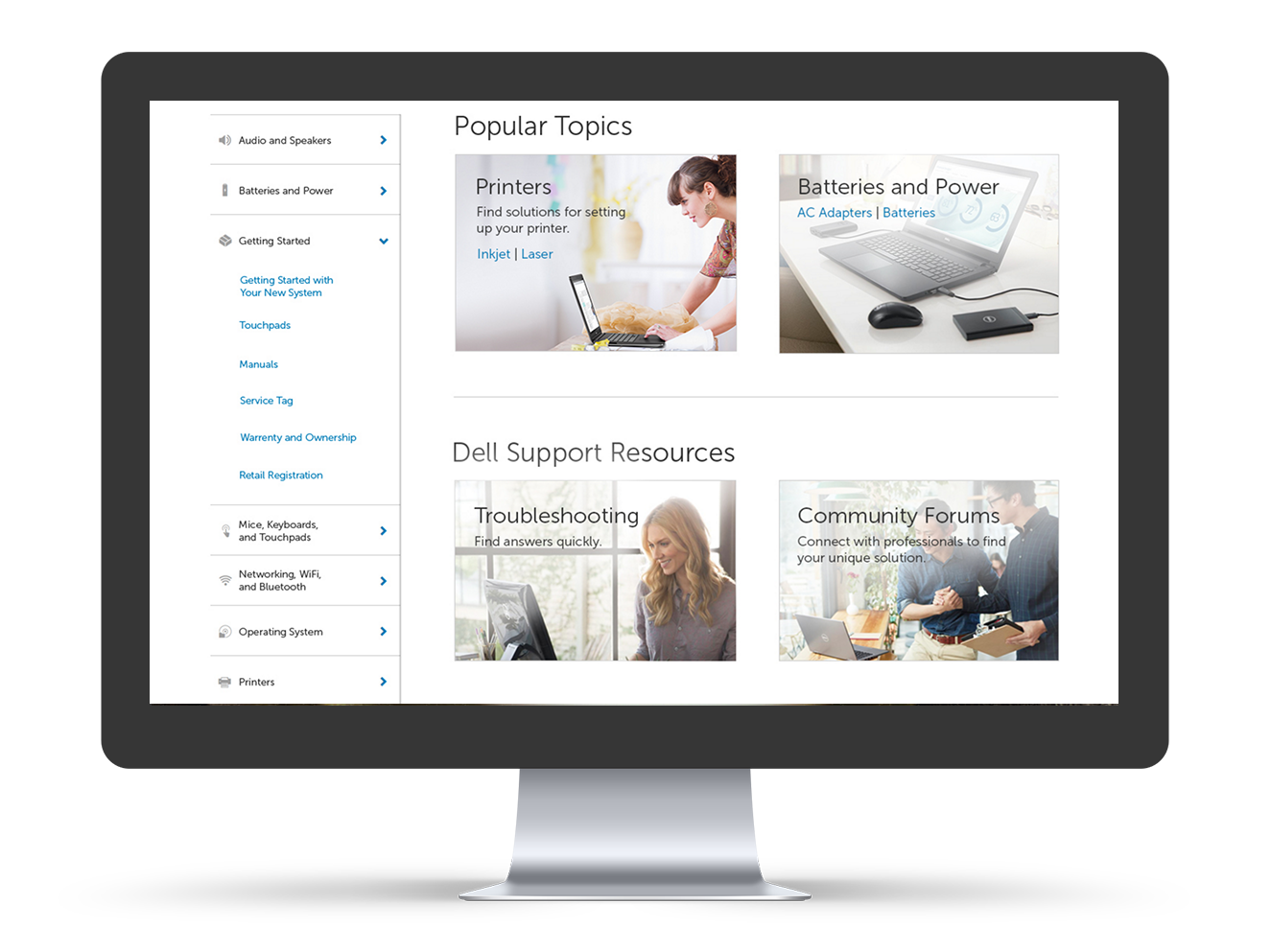
Contextual Side Navigation
Visitors needed a way to scan related articles when landing on an article that didn't have exactly what they needed. The contextual side navigation served related articles in a table of contents manner.
Cleaner Hierarchy of Content
To help visitors scan the content of each article, the use of an improved font ramp, visual anchors and dividers was implemented.